
Optimizing Images - Part 1

Imagine this scenario: you open a website on your phone, you see an image loading really really slowly, you wonder what’s going on and download the image to see more details… turns out the image is 3000x3000px with a size of 1.5Mb!
So, let’s talk about different ways to optimize images, common problems, and ways to find these issues early.
There are essentially 2 types of images we can use on the web: Vector Graphics and Raster Images. This blog post is about optimizations for Raster Images and it is the first of a series of blog posts about optimizing images. We will talk about Vector Graphics in the next one.
Raster Images
This is what we typically associate with pictures, complex images with details at the pixel level (think of any picture you take with a phone). The file includes information about what to draw in each pixel.
The simplest format is a Bitmap which is basically a list of all the pixels and which color to use for each. Images in this file format are typically really big in file size since there’s no optimization applied.
The most popular formats to store raster images with compression are JPEG and PNG , each of them has its uses. There are also older and newer formats, like GIF or WEBP .
Lossy vs Lossless
JPEG uses a lossy compression algorithm. This means it can be configured to lose quality (i.e.: drop the information of some pixels and use surrounding ones) in order to save less pixels’ data. The lower the quality, the lower the file size, but a really low quality can generate visual artifacts.
PNG uses a lossless compression algorithm. This means it will try to compress the pixel data without dropping any information, so the image looks exactly like the original bitmap.
Because of this difference, JPEG is great for pictures and PNG is better for digital drawings and screenshots (to name a few).
There are other formats, like the modern WEBP, that support both lossy and lossless compression as well as animations and in some cases with better compression than both JPEG and PNG. Also AVIF is starting to gain support in browsers.
WEBP is supported in all modern browsers, you can check caniuse.com/?search=webp to know if webp and avif are good formats for your use case.
Optimizing Type, Size, and Quality
The first optimization we should apply to our images is to use the right format, the right size, and the right quality (if using a lossy format).
Regarding size, this will depend on where the image is used. If we have an img tag that is intended to have a maximum size of 400px in the site, we should resize the image to that size. No more and no less.
For the format, there’s not one size fits all rule here. The best option is to open the image in an image editor (or use an online tool) to save it in different formats and compare the results.
Finally, when using a lossy format, we can try different quality settings and compare the results. Again, there’s no one quality fits all rule; for some images, a quality of 80% or even lower might be acceptable, and for some it may introduce too many artifacts. It depends on the content of the image.
Let’s check these options with an example (Chanchi, my dog):


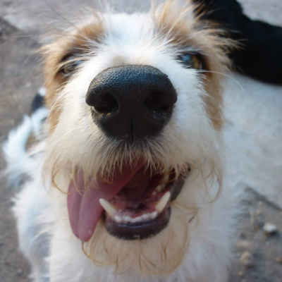

You can see how the JPEG image at 80% quality looks good, at 40% quality some noise starts to show up around the hair, and at 20% quality it’s noticeably pixelated. Additionally, the webp format in 100% quality is half the size of the JPEG one at 100% quality. The same happens at 80% quality. PNG is clearly a bad idea for an image like this.
The <picture> Element
When we consider responsive design, one single img tag is not enough to fully optimize the image we want to display.
An element on our site can have different sizes and limits depending on the size of the device and the design decisions. If we always serve images based on the biggest size needed for a desktop browser we would be serving images that are too big in smaller devices, wasting resources and making the app slower.
Imagine an image that’s 1200px wide when the site is displayed in a desktop browser. If we open the site on a phone, the width of the page is (typically) around 400px, so we could deliver a 400px image in these cases instead, in a much smaller file.
We can use the picture tag for this, which allows us to specify multiple image sources and different rules so the browser can decide which image to fetch from the server.
Let’s continue with the previous example and also add a medium size of 800px for the tablet design.
Our original code, with an image tag, would be this:
<%= image_tag "my-image.webp" %>
But we can create different images with different sizes and specify all of them:
<picture>
  <source srcset="my-image-small.webp" media="(max-width: 400px)" />
  <source srcset="my-image-medium.webp" media="(min-width: 800px)" />
  <%= image_tag "my-image-large.webp" %>
</picture>
We need the img tag inside the picture tag and any number of source tags to specify the different rules. If no rule matches, the browser will render the img tag with default source.
By doing this, the browser only downloads the image that matches a rule.
Another benefit of this is that we can change not only the size but also the image aspect ratio or even use completely different images to better optimize the cropping instead of relying on the browser and CSS rules for that.
This example only shows using a CSS media query to check the width of the device, but we can also specify the device’s pixel ratio, the preferred color scheme, chose between animated and non-animated images (for users that turned on the reduced motion features), different file types (if we want to use formats like AVIF if the browser supports it), etc.
Read more about the
<picture>element here: developer.mozilla.org/en-US/docs/Web/HTML/Element/picture
Finding non-optimized Images
Finding all the images that can be optimized can be a tedious process to do manually.
We can use Google Lighthouse ’s Performance analysis in both Mobile and Desktop mode and it will give us a list of images that can be optimized and the different optimizations that could be applied:
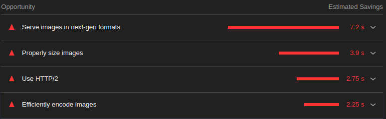
The Service images in next-gen formats section shows the benefit of converting PNG and JPEG images into WEBP or AVIF.
The Properly size images list shows images that are too big for the actual display size.
Finally, the Efficiently encode images shows the benefit of encoding JPEG images with a quality of 85%.
Conclusion
Poorly optimized images can generate megabytes of extra unneeded downloads and seconds of waiting. Images are some of the biggest assets we deliver and it’s important to keep them under control so our users can have a better experience.
In this article we covered the basics, but these are MUST DO optimizations that can mean a really big improvement in performance and are needed before doing other (and, in some cases, complex) optimizations. We can further optimize how we serve images but we will talk about that in the next articles of this series.
Do you need help improving the performance of your application? Check our Tune Report service, we can help you!